Evie NETWORKS
Redesigning an EV charging app for Australian drivers
Evie NETWORKS
Redesigning an EV charging app for Australian drivers
Evie Networks is one of Australia's largest EV charging networks, with sites in every state and territory. I worked in a two person design team to redesign their own mobile app, from early sketches through to a production ready design system for iOS and Android.
My Role
Ideation
Sketching
Hi-fi Prototype
Team & duration
2 UX/UI consultants
9 week sprint
when
2023
Methods
Feature prioritisation
Visual design
Deliverables
Hi-fi App Prototype
Design System
Wireframes
Tools
Figma
Evie Networks is one of Australia's largest EV charging networks, with sites in every state and territory. I worked in a two person design team to redesign their own mobile app, from early sketches through to a production ready design system for iOS and Android.
My Role
Ideation
Sketching
Hi-fi Prototype
Team & duration
2 UX/UI consultants
9 week sprint
when
2023
Methods
Feature prioritisation
Visual design
Deliverables
Hi-fi App Prototype
Design System
Wireframes
Tools
Figma
Evie Networks is one of Australia's largest EV charging networks, with sites in every state and territory. I worked in a two person design team to redesign their own mobile app, from early sketches through to a production ready design system for iOS and Android.
My Role
Ideation
Sketching
Hi-fi Prototype
Team & duration
2 UX/UI consultants
9 week sprint
when
2023
Methods
Feature prioritisation
Visual design
Deliverables
Hi-fi App Prototype
Design System
Wireframes
Tools
Figma
Overview
Australia's charging network is growing quickly, and most drivers using it are new to it. Charging still asks a lot of someone: find a site, work out whether it is free, plug in, and trust that the session has actually started.
Evie wanted an app built around that moment at the kerbside, and a design foundation they could keep building on.

Overview
Australia's charging network is growing quickly, and most drivers using it are new to it. Charging still asks a lot of someone: find a site, work out whether it is free, plug in, and trust that the session has actually started.
Evie wanted an app built around that moment at the kerbside, and a design foundation they could keep building on.

Overview
Australia's charging network is growing quickly, and most drivers using it are new to it. Charging still asks a lot of someone: find a site, work out whether it is free, plug in, and trust that the session has actually started.
Evie wanted an app built around that moment at the kerbside, and a design foundation they could keep building on.
FIVE THINGS THE APP HAD TO GET RIGHT
1
Sign up happens at the kerbside
Most people create an account standing next to a charger, usually in a hurry. We cut the flow to the shortest path that still gets someone charging, and let the app introduce the rest later.
2
The map answers one question
Where can I charge, right now. The map opens oriented to your location and colour codes availability, so the answer arrives before the first tap.
3
Starting a charge is one action
Once the cable is in, anything more than a single obvious tap turns a simple task into a decision. Start Charge became the primary action on the site page, with unavailable connectors taken out of the way.
4
A platform that couldn't scale
The existing third-party app couldn't support Evie's upcoming product launches: memberships, fleet accounts, subscriptions, Tap & Go, and multi-user accounts.
4
The session has to look like it is working
Drivers wait beside the car. The status screen gives live proof that energy is flowing, what it is costing, and when they can leave.
5
The design has to grow
The app was the first of several releases. A scalable structure and a component library meant new features could be added without starting over.
Previous design

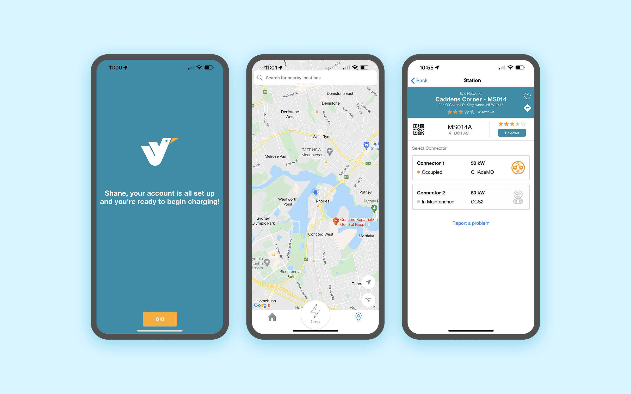
the deisgn
THE MAP DOES THE HEAVY LIFTING
Colour coded availability means a driver can read a whole corridor of sites without tapping anything, and pick the one that is actually free. When someone is standing at a site, the app opens that site's information automatically. No searching for the charger you are already looking at.
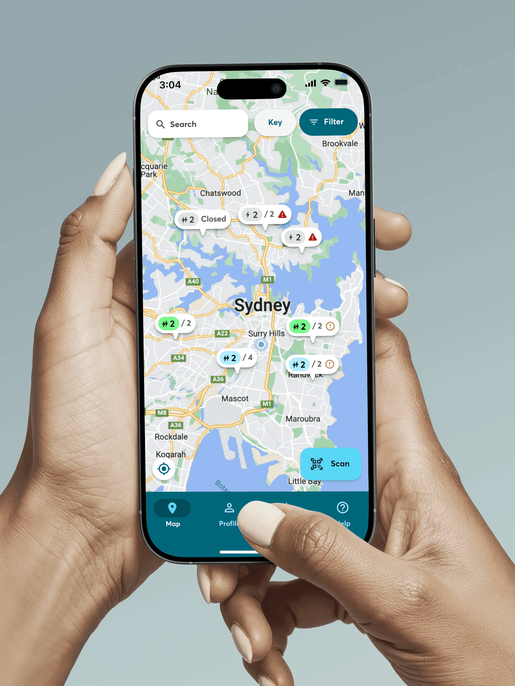

the deisgn
THE MAP DOES THE HEAVY LIFTING
Colour coded availability means a driver can read a whole corridor of sites without tapping anything, and pick the one that is actually free. When someone is standing at a site, the app opens that site's information automatically. No searching for the charger you are already looking at.
the deisgn
THE MAP DOES THE HEAVY LIFTING
Colour coded availability means a driver can read a whole corridor of sites without tapping anything, and pick the one that is actually free. When someone is standing at a site, the app opens that site's information automatically. No searching for the charger you are already looking at.
ONE BUTTON TO START A CHARGE
Connectors that are out of service or in use are hidden from the selection screen, so drivers only choose between chargers they can actually use. Everything else on the site page sits underneath that one action. Plug in, tap once, done.


ONE BUTTON TO START A CHARGE
Connectors that are out of service or in use are hidden from the selection screen, so drivers only choose between chargers they can actually use. Everything else on the site page sits underneath that one action. Plug in, tap once, done.
CONFIDENCE DURING THE SESSION
The status screen shows the four things people actually want to know: energy delivered, state of charge, time elapsed, and what it is costing so far. Notifications arrive at 80% and again when the session ends, so nobody gets caught out by idle fees.

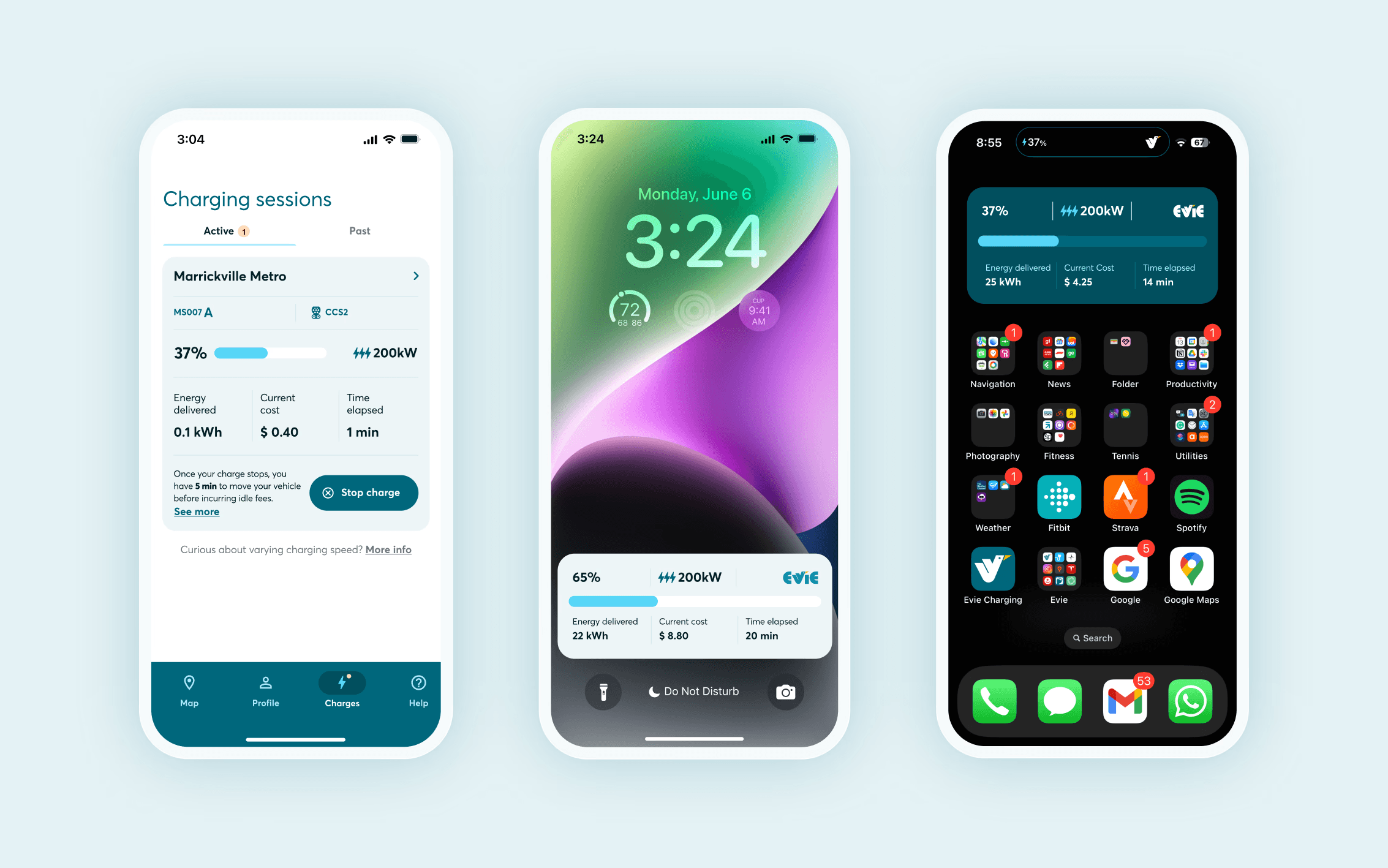
CONFIDENCE DURING THE SESSION
The status screen shows the four things people actually want to know: energy delivered, state of charge, time elapsed, and what it is costing so far. Notifications arrive at 80% and again when the session ends, so nobody gets caught out by idle fees.
A DESIGN SYSTEM BUILT FOR CLARITY
Underneath the product is a Figma design system built from scratch for a real time experience, where almost every component has to communicate a status.
That covers availability indicators, connector selectors for CCS2, CHAdeMO and AC, live session widgets, and a structured onboarding step component that keeps the sign up flow consistent. Light and dark variants were built in from the start.
The result is a small, purposeful library that gave the product one visual language and gave the developers something reliable to build from.


A DESIGN SYSTEM BUILT FOR CLARITY
Underneath the product is a Figma design system built from scratch for a real time experience, where almost every component has to communicate a status.
That covers availability indicators, connector selectors for CCS2, CHAdeMO and AC, live session widgets, and a structured onboarding step component that keeps the sign up flow consistent. Light and dark variants were built in from the start.
The result is a small, purposeful library that gave the product one visual language and gave the developers something reliable to build from.
A DESIGN SYSTEM BUILT FOR CLARITY
Underneath the product is a Figma design system built from scratch for a real time experience, where almost every component has to communicate a status.
That covers availability indicators, connector selectors for CCS2, CHAdeMO and AC, live session widgets, and a structured onboarding step component that keeps the sign up flow consistent. Light and dark variants were built in from the start.
The result is a small, purposeful library that gave the product one visual language and gave the developers something reliable to build from.
More works