Evie NETWORKS

Designing Australia's most intuitive EV charging app.

Evie NETWORKS

Designing Australia's most intuitive EV charging app.

Evie Networks is Australia's fastest growing EV charging network, backed by the St Baker Energy Innovation Fund and Federal/State Government support. With locations across every Australian State and Territory, Evie's mission is simple: give EV drivers the freedom of the open road.

My Role

Ideation
Sketching
Hi-fi Prototype

Team & duration

2 UX/UI consultants
9 week sprint

when

2023

Methods

Feature prioritisation
Visual design

Deliverables

Hi-fi App Prototype
Design System
Wireframes

Tools

Figma

Evie Networks is Australia's fastest growing EV charging network, backed by the St Baker Energy Innovation Fund and Federal/State Government support. With locations across every Australian State and Territory, Evie's mission is simple: give EV drivers the freedom of the open road.

My Role

Ideation
Sketching
Hi-fi Prototype

Team & duration

2 UX/UI consultants
9 week sprint

when

2023

Methods

Feature prioritisation
Visual design

Deliverables

Hi-fi App Prototype
Design System
Wireframes

Tools

Figma

Evie Networks is Australia's fastest growing EV charging network, backed by the St Baker Energy Innovation Fund and Federal/State Government support. With locations across every Australian State and Territory, Evie's mission is simple: give EV drivers the freedom of the open road.

My Role

Ideation
Sketching
Hi-fi Prototype

Team & duration

2 UX/UI consultants
9 week sprint

when

2023

Methods

Feature prioritisation
Visual design

Deliverables

Hi-fi App Prototype
Design System
Wireframes

Tools

Figma

Overview

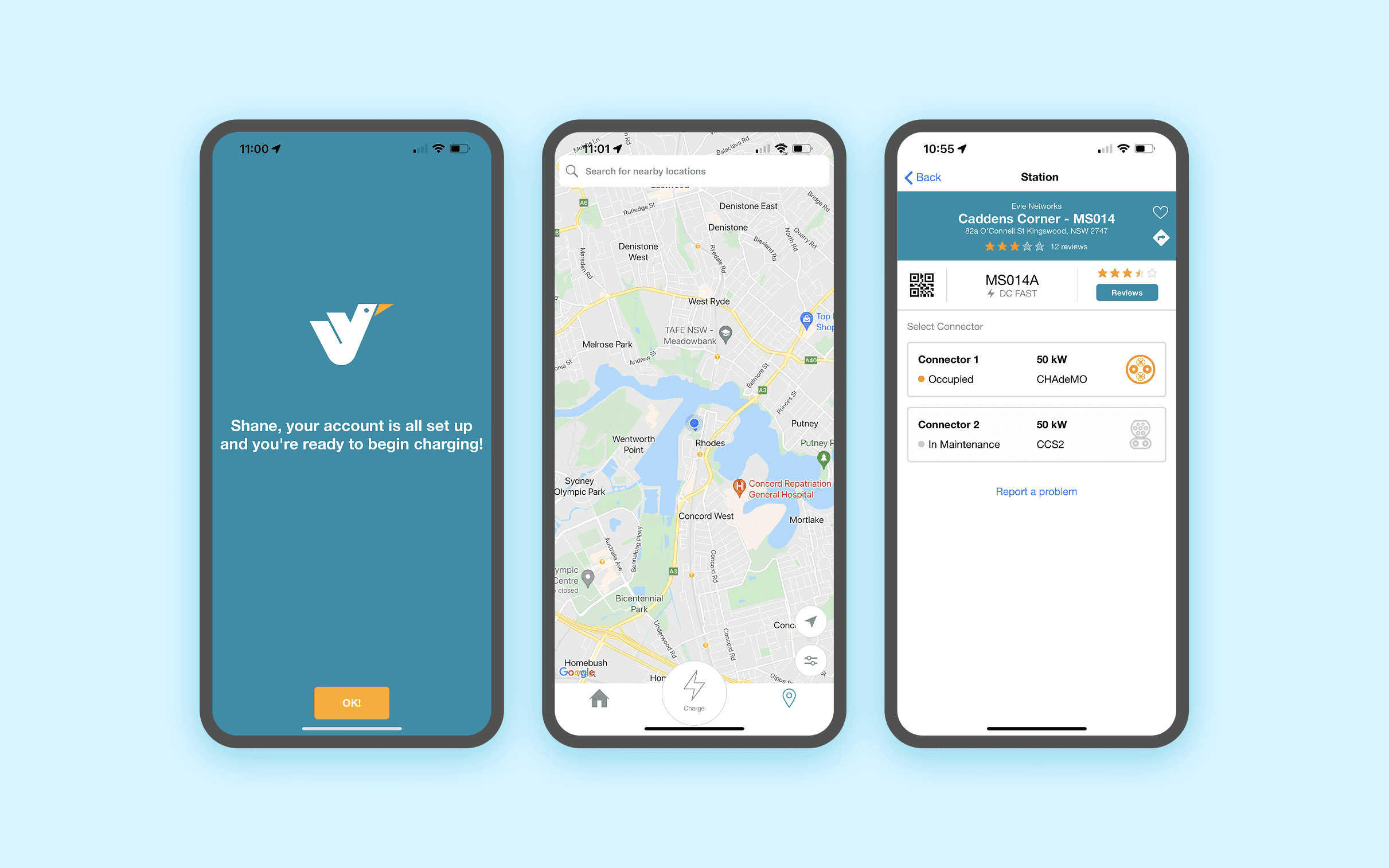
A UX review covering current users, first-time users and EV intenders, surfaced clear frustrations: onboarding was clunky, the map was unclear, and starting a charge required too many steps. At the same time, Evie needed to build for growth, with fleet, subscription, and multi-user products on the roadmap.

Overview

A UX review covering current users, first-time users and EV intenders, surfaced clear frustrations: onboarding was clunky, the map was unclear, and starting a charge required too many steps. At the same time, Evie needed to build for growth, with fleet, subscription, and multi-user products on the roadmap.

Overview

A UX review covering current users, first-time users and EV intenders, surfaced clear frustrations: onboarding was clunky, the map was unclear, and starting a charge required too many steps. At the same time, Evie needed to build for growth, with fleet, subscription, and multi-user products on the roadmap.

KEY UX CHALLENGES

The existing EVConnect white-label app was frustrating users and limiting Evie's commercial ambitions. A prior UX review spanning current users, first-time users, and prospective EV buyers, had already surfaced the core pain points. The mandate was clear: design from scratch, for real Australians, built to scale.

1

Friction at first use

Most users onboard at the charger for the first time — often in a hurry. The existing app made this painful. Every extra step was a risk of losing the customer.


2

A map that didn't work hard enough

The map is the centrepiece of the experience. Users needed to quickly locate chargers, understand availability at a glance, and start charging with a single action.


3

No clear charging status

Once plugged in, users had no confidence the charge was working. Key data — kWh delivered, cost, time elapsed, state of charge — was buried or missing.


4

A platform that couldn't scale

The existing third-party app couldn't support Evie's upcoming product launches: memberships, fleet accounts, subscriptions, Tap & Go, and multi-user accounts.


4

A platform that couldn't scale

The existing third-party app couldn't support Evie's upcoming product launches: memberships, fleet accounts, subscriptions, Tap & Go, and multi-user accounts.


5

Poor visual & interaction design

The existing app lacked brand coherence, clear hierarchy, and the design system needed to scale a complex product.

Solution Highlights

The delivered MVP covered the full core journey: onboarding, map and site discovery, charger identification, session initiation, real-time status monitoring, session completion, and profile management, alongside the foundational fleet functionality required for Evie's early beta partner programme. Key design decisions worth highlighting:

1

Making EV 
charging effortless

The core design challenge simplify the process. Finding a charger, authenticating, initiating a session, monitoring it, and paying, ultimately creating an experience that felt invisible.


1

Making EV charging effortless

The core design challenge simplify the process. Finding a charger, authenticating, initiating a session, monitoring it, and paying, ultimately creating an experience that felt invisible.


2

Provide contextual and helpful information

Make sure users can access helpful information when needed.


3

Future proof design

Create a scalable architecture to support future products like fleet management and home charging.
One button to start a charge

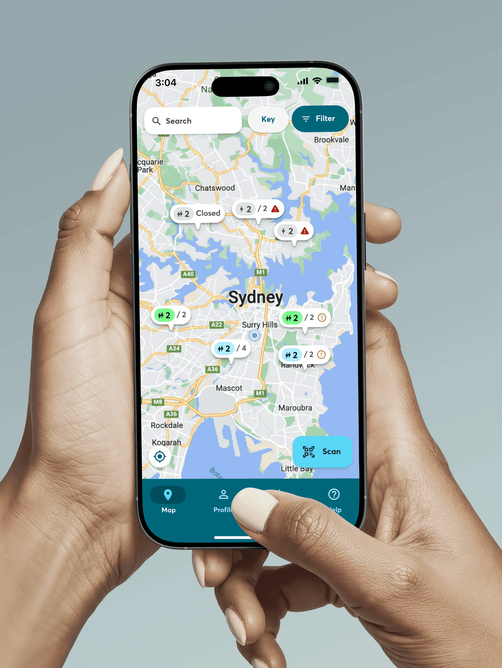
The map is the first thing users see and the most important surface in the app. We designed it to orient to the user's location instantly, surface real-time charger availability through colour-coded status (green/blue/orange/red), and auto-open site information when a user is standing at a charger.

One button to start a charge

The map is the first thing users see and the most important surface in the app. We designed it to orient to the user's location instantly, surface real-time charger availability through colour-coded status (green/blue/orange/red), and auto-open site information when a user is standing at a charger.

One button to start a charge

The map is the first thing users see and the most important surface in the app. We designed it to orient to the user's location instantly, surface real-time charger availability through colour-coded status (green/blue/orange/red), and auto-open site information when a user is standing at a charger.

One button to start a charge.

Starting a charge needed to be a single action once the user was plugged in. We hid unavailable connectors from the selection screen to reduce cognitive load, and placed the Start Charge CTA as the primary action on the site information page.

One button to start a charge.

Starting a charge needed to be a single action once the user was plugged in. We hid unavailable connectors from the selection screen to reduce cognitive load, and placed the Start Charge CTA as the primary action on the site information page.

Confidence during the session

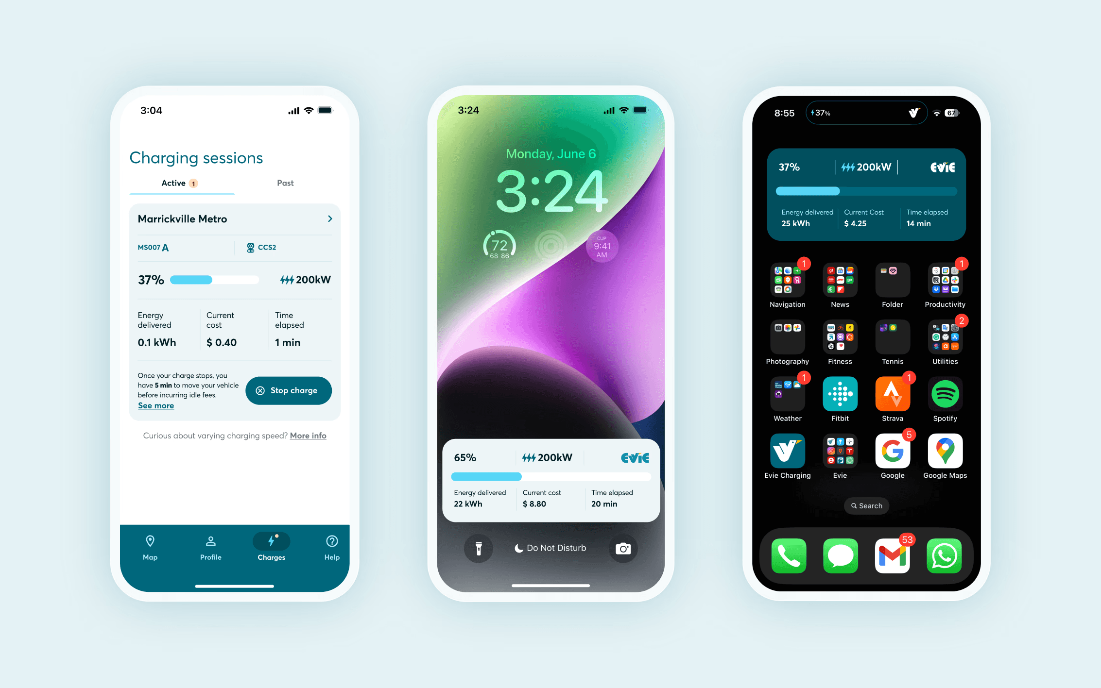
The charging status screen gave users live visibility over the four metrics that matter: kWh delivered, state of charge (%), elapsed time, and running cost. Push notifications alert users at 80% SoC and at session end to prevent idle fees.

Confidence during the session

The charging status screen gave users live visibility over the four metrics that matter: kWh delivered, state of charge (%), elapsed time, and running cost. Push notifications alert users at 80% SoC and at session end to prevent idle fees.

Cross platform experience

To extend the experience beyond the phone, we designed a companion Apple Watch app that puts the most time-sensitive information exactly where drivers need it, without ever reaching for their pocket. From the watch, users can browse nearby saved stations and check real-time charger availability before they arrive, then monitor their active session with live data including state of charge, energy delivered, current cost, and time elapsed. A clear idle fee warning surfaces directly on the wrist the moment a session ends, giving drivers the heads-up they need to avoid unnecessary charges. The Stop Charge action is a single tap away. Designed for the moments when a driver is outside the car, hands full, or simply doesn't want to unlock their phone, the Watch app transforms a passive wait into an informed, in-control experience.

Cross platform experience

To extend the experience beyond the phone, we designed a companion Apple Watch app that puts the most time-sensitive information exactly where drivers need it, without ever reaching for their pocket. From the watch, users can browse nearby saved stations and check real-time charger availability before they arrive, then monitor their active session with live data including state of charge, energy delivered, current cost, and time elapsed. A clear idle fee warning surfaces directly on the wrist the moment a session ends, giving drivers the heads-up they need to avoid unnecessary charges. The Stop Charge action is a single tap away. Designed for the moments when a driver is outside the car, hands full, or simply doesn't want to unlock their phone, the Watch app transforms a passive wait into an informed, in-control experience.

A design system built for clarity at every state

Underpinning the entire product is a Figma design system built from the ground up to handle the complexity of a real-time charging experience. Every component was designed to communicate status at a glance — from charger availability indicators and connector type selectors (CHAdeMO, CCS2, AC) through to live charging widgets showing state of charge, energy delivered, current cost and time elapsed. Light and dark variants were built in from the start to support both the phone and Watch surfaces, while a structured onboarding step component ensured the sign-up flow felt consistent and measurable at every stage. The result is a library of purposeful, reusable components that gave the product a coherent visual language and gave the development team a reliable foundation to build from.

A design system built for clarity at every state

Underpinning the entire product is a Figma design system built from the ground up to handle the complexity of a real-time charging experience. Every component was designed to communicate status at a glance — from charger availability indicators and connector type selectors (CHAdeMO, CCS2, AC) through to live charging widgets showing state of charge, energy delivered, current cost and time elapsed. Light and dark variants were built in from the start to support both the phone and Watch surfaces, while a structured onboarding step component ensured the sign-up flow felt consistent and measurable at every stage. The result is a library of purposeful, reusable components that gave the product a coherent visual language and gave the development team a reliable foundation to build from.

A design system built for clarity at every state

Underpinning the entire product is a Figma design system built from the ground up to handle the complexity of a real-time charging experience. Every component was designed to communicate status at a glance — from charger availability indicators and connector type selectors (CHAdeMO, CCS2, AC) through to live charging widgets showing state of charge, energy delivered, current cost and time elapsed. Light and dark variants were built in from the start to support both the phone and Watch surfaces, while a structured onboarding step component ensured the sign-up flow felt consistent and measurable at every stage. The result is a library of purposeful, reusable components that gave the product a coherent visual language and gave the development team a reliable foundation to build from.

More works