hailo

Designing an app that lets people with impaired vision hail their own bus

hailo

Designing an app that lets people with impaired vision hail their own bus

hailo

Designing an app that lets people with impaired vision hail their own bus

Hailo is an Australian accessible transport startup founded by Santiago Velasquez, a blind engineer who once missed an exam because three buses passed him at the stop. That experience became the founding problem: giving passengers of all abilities a way to hail a bus from their phone, in real time, so drivers know exactly where and when to stop.

Hailo currently runs on Melbourne's Ventura bus network, with more networks planned. My role was to take the product and research direction and shape it into an app that felt trustworthy, accessible and easy to use for everyone.

My Role

Research Synthesis
Iterative Wireframing
Visual Design
Design Systems

Team & duration

2 designers
9 weeks sprint

when

2023-24

Methods

Feature prioritisation
Visual design

Deliverables

Hi-fi App Prototype
Design System
Wireframes

Tools

Figma

Hailo is an Australian accessible transport startup founded by Santiago Velasquez, a blind engineer who once missed an exam because three buses passed him at the stop. That experience became the founding problem: giving passengers of all abilities a way to hail a bus from their phone, in real time, so drivers know exactly where and when to stop.

Hailo currently runs on Melbourne's Ventura bus network, with more networks planned. My role was to take the product and research direction and shape it into an app that felt trustworthy, accessible and easy to use for everyone.

My Role

Research Synthesis
Iterative Wireframing
Visual Design
Design Systems

Team & duration

2 designers
9 weeks sprint

when

2023-24

Methods

Feature prioritisation
Visual design

Deliverables

Hi-fi App Prototype
Design System
Wireframes

Tools

Figma

Hailo is an Australian accessible transport startup founded by Santiago Velasquez, a blind engineer who once missed an exam because three buses passed him at the stop. That experience became the founding problem: giving passengers of all abilities a way to hail a bus from their phone, in real time, so drivers know exactly where and when to stop.

Hailo currently runs on Melbourne's Ventura bus network, with more networks planned. My role was to take the product and research direction and shape it into an app that felt trustworthy, accessible and easy to use for everyone.

My Role

Research Synthesis
Iterative Wireframing
Visual Design
Design Systems

Team & duration

2 designers
9 weeks sprint

when

2023-24

Methods

Feature prioritisation
Visual design

Deliverables

Hi-fi App Prototype
Design System
Wireframes

Tools

Figma

Understanding the Challenge

Research with current and prospective riders, including people who are blind or have mobility impairments, showed that everyone shares similar transit needs, but the stakes are higher for disabled riders. A missed bus isn't just inconvenient. One participant even crossed against a signal to avoid missing their service.

The research also pointed to a wider issue: accessibility gaps sit between systems as much as within them. Disconnected ticketing, partial digital tools, unreadable QR codes and maps, and auditory timetables lost in noisy environments all add up to a stressful journey.

Early usability testing of the app also flagged specific friction. The hail button's colour change wasn't always understood, live location data wasn't fully reliable, and status screens buried useful information, like ETA, behind less relevant detail.

Understanding the Challenge

Research with current and prospective riders, including people who are blind or have mobility impairments, showed that everyone shares similar transit needs, but the stakes are higher for disabled riders. A missed bus isn't just inconvenient. One participant even crossed against a signal to avoid missing their service.

The research also pointed to a wider issue: accessibility gaps sit between systems as much as within them. Disconnected ticketing, partial digital tools, unreadable QR codes and maps, and auditory timetables lost in noisy environments all add up to a stressful journey.

Early usability testing of the app also flagged specific friction. The hail button's colour change wasn't always understood, live location data wasn't fully reliable, and status screens buried useful information, like ETA, behind less relevant detail.

Understanding the Challenge

Research with current and prospective riders, including people who are blind or have mobility impairments, showed that everyone shares similar transit needs, but the stakes are higher for disabled riders. A missed bus isn't just inconvenient. One participant even crossed against a signal to avoid missing their service.

The research also pointed to a wider issue: accessibility gaps sit between systems as much as within them. Disconnected ticketing, partial digital tools, unreadable QR codes and maps, and auditory timetables lost in noisy environments all add up to a stressful journey.

Early usability testing of the app also flagged specific friction. The hail button's colour change wasn't always understood, live location data wasn't fully reliable, and status screens buried useful information, like ETA, behind less relevant detail.

KEY UX CHALLENGES

1

Onboarding that excluded people in a hurry

Many users sign up at the bus stop under time pressure, yet the flow lacked clear guidance, an accessible explainer, and an easy-to-find privacy policy.

2

A hail interaction that didn't inspire confidence

Hailing a bus is the most important action in the app. Its button and feedback states needed to clearly confirm a hail had gone through.

3

Modernisation gap

The interface needed a consistent, contemporary look with accessibility built in from the start, not added on top.

4

A platform that couldn't scale

The existing third-party app couldn't support Evie's upcoming product launches: memberships, fleet accounts, subscriptions, Tap & Go, and multi-user accounts.

4

A map and status system with unclear signals

Icons, routes and vehicle status needed to be legible and screen reader friendly.

5

No way to give feedback or flag issues

There was no built-in way to share post-trip feedback or report problems, both valuable for a young product still learning from real use.

6

Account and access settings buried in flows

Basic account updates required going through a password reset, and access needs lacked a clean way to select multiple requirements.

Feature prioritisation

The brief was structured into two tiers. This let us focus early effort on the highest stakes moments, onboarding and hailing, before extending into planning and discovery features.

1

covered the essentials

 Onboarding
 Account management
 The hail screen
 Feedback
 The map
 Trip planning
 Help
 Access requirements

2

built on that foundation

Search
Trip sharing
Directional information
Nearby vehicle alerts

Ideation

We explored how to make hailing a bus feel as reliable as pressing a doorbell

Every decision was tested against the same question: does this make sense to someone using VoiceOver, someone glancing at their screen for two seconds, and someone standing at a stop in the rain?

Ideation

We explored how to make hailing a bus feel as reliable as pressing a doorbell

Every decision was tested against the same question: does this make sense to someone using VoiceOver, someone glancing at their screen for two seconds, and someone standing at a stop in the rain?

Onboarding people in a hurry

We redesigned onboarding for speed and clarity: a quick sign-in flow, short walkthrough of core features, and accessibility and trip preferences that's easy to find later.

Onboarding people in a hurry

We redesigned onboarding for speed and clarity: a quick sign-in flow, short walkthrough of core features, and accessibility and trip preferences that's easy to find later.

A map built for more than sight

The map sits alongside list views which can be toggled between nearby transit stops and favourite routes and stops. When checking the list of nearby transit stops, the top section of the list shows stops that have transit routes or lines that Hailing is available for.

A map built for more than sight

The map sits alongside list views which can be toggled between nearby transit stops and favourite routes and stops. When checking the list of nearby transit stops, the top section of the list shows stops that have transit routes or lines that Hailing is available for.

A hail button you can trust

We refined the button's shape, colour and feedback so a successful hail is unmistakable, adding haptic and audio options alongside the visual state change.

A hail button you can trust

We refined the button's shape, colour and feedback so a successful hail is unmistakable, adding haptic and audio options alongside the visual state change.

Closing the loop with feedback and diagnostics

We designed a well-timed post-trip feedback flow, plus a simple diagnostics tool so users can flag issues with useful context attached.

Closing the loop with feedback and diagnostics

We designed a well-timed post-trip feedback flow, plus a simple diagnostics tool so users can flag issues with useful context attached.

Access requirements that scale We designed a selection

UI that supports multiple, specific access needs while staying clean and quick to use.

Access requirements that scale We designed a selection

UI that supports multiple, specific access needs while staying clean and quick to use.

Summary

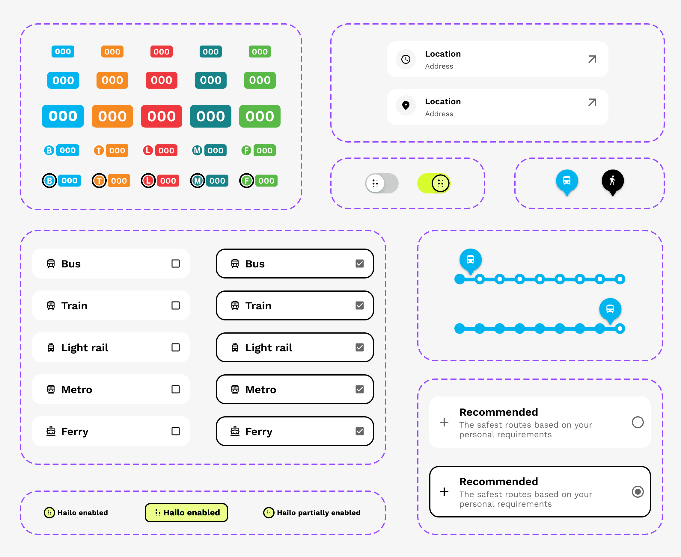
Hailo called for more than usability. It called for trust, in a context where a missed signal has real consequences. The work spanned research synthesis, iterative wireframing and a hi-fi prototype and design system built to scale.

Hailo is now live on the App Store, running on Melbourne's Ventura network, with early feedback that's been genuinely positive.