
THE BRIEF
King Power's broad appeal is a strength for the business, but it made life difficult for its top tier. A brand that speaks to everyone struggles to signal anything truly exclusive, and The Atlas Club risked feeling like a more expensive version of the everyday card.
King Power needed an identity that could stand apart from its main programme while still belonging to it. It had to feel premium without being loud, and carry the sense of status members had earned across every touchpoint, from membership cards and lounges to the app, printed communications and travel accessories.

The insight
True luxury doesn't need to announce itself. The strategy identified what The Atlas Club had to get right:
1
A world apart
The club had to read as its own destination, clearly separate from the mass market side of King Power.
2
Recognised, not displayed
Members value discretion. The identity should be noticed by those who know, rather than shouted at everyone else.
3
One experience, many moments
From lounge to limousine to app, the brand needed to hold together across physical spaces, personal service and digital touchpoints.
THE Concept
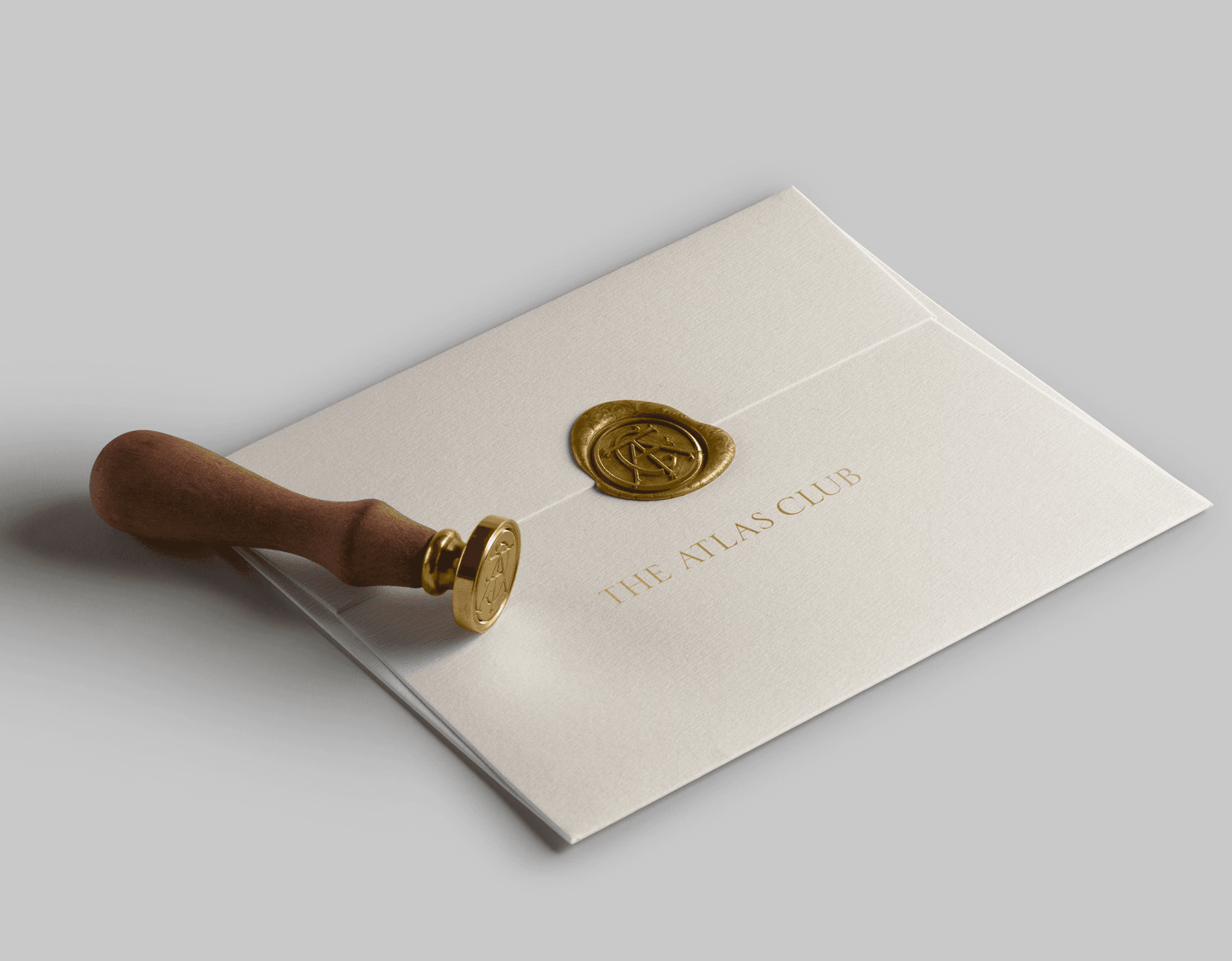
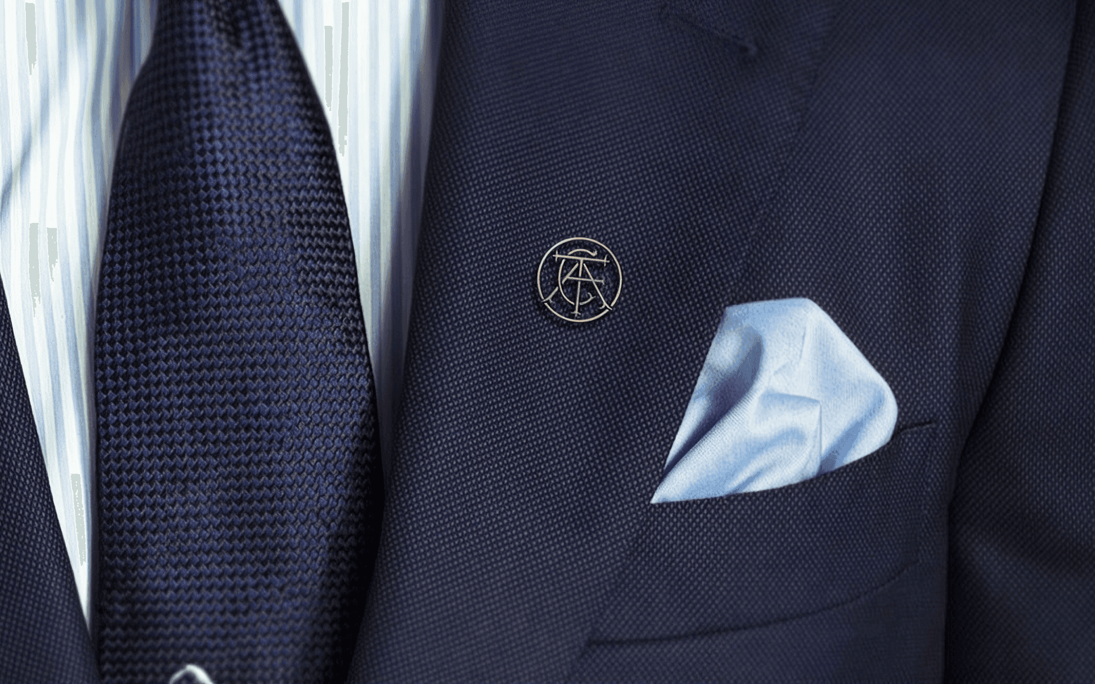
The identity is built around a monogram, the classic signature of private clubs, fine tailoring and heirloom goods. The initials of The Atlas Club are interlaced within a single circle, finished with calligraphic flourishes and rendered in a warm gold, so the mark reads less like a logo and more like a seal of membership. It is paired with a classical serif wordmark and a quilted pattern inspired by luxury upholstery, set against a calm palette of white and gold.
The result is a refined, timeless identity that feels discreet rather than flashy, giving The Atlas Club a clear sense of distance from King Power's wider programme. Detailed guidelines ensure the mark and its supporting elements are applied with the same care everywhere, from membership cards and lounges to the app and members' gifts.






More works